AURÉLIE BENAIS
ART DIRECTOR - DESIGN DIRECTOR
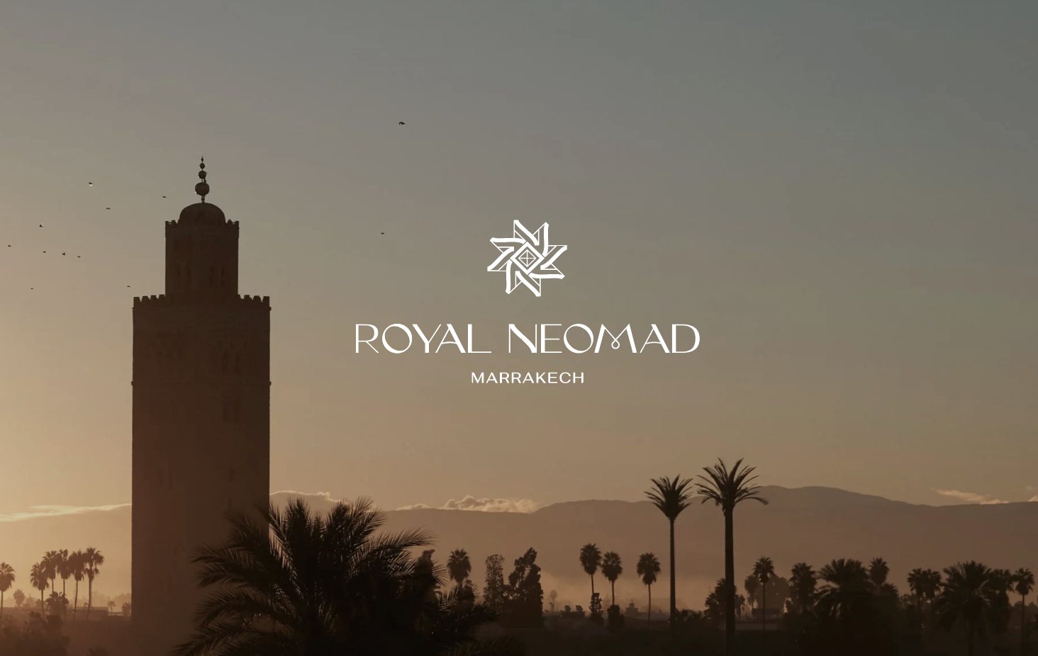
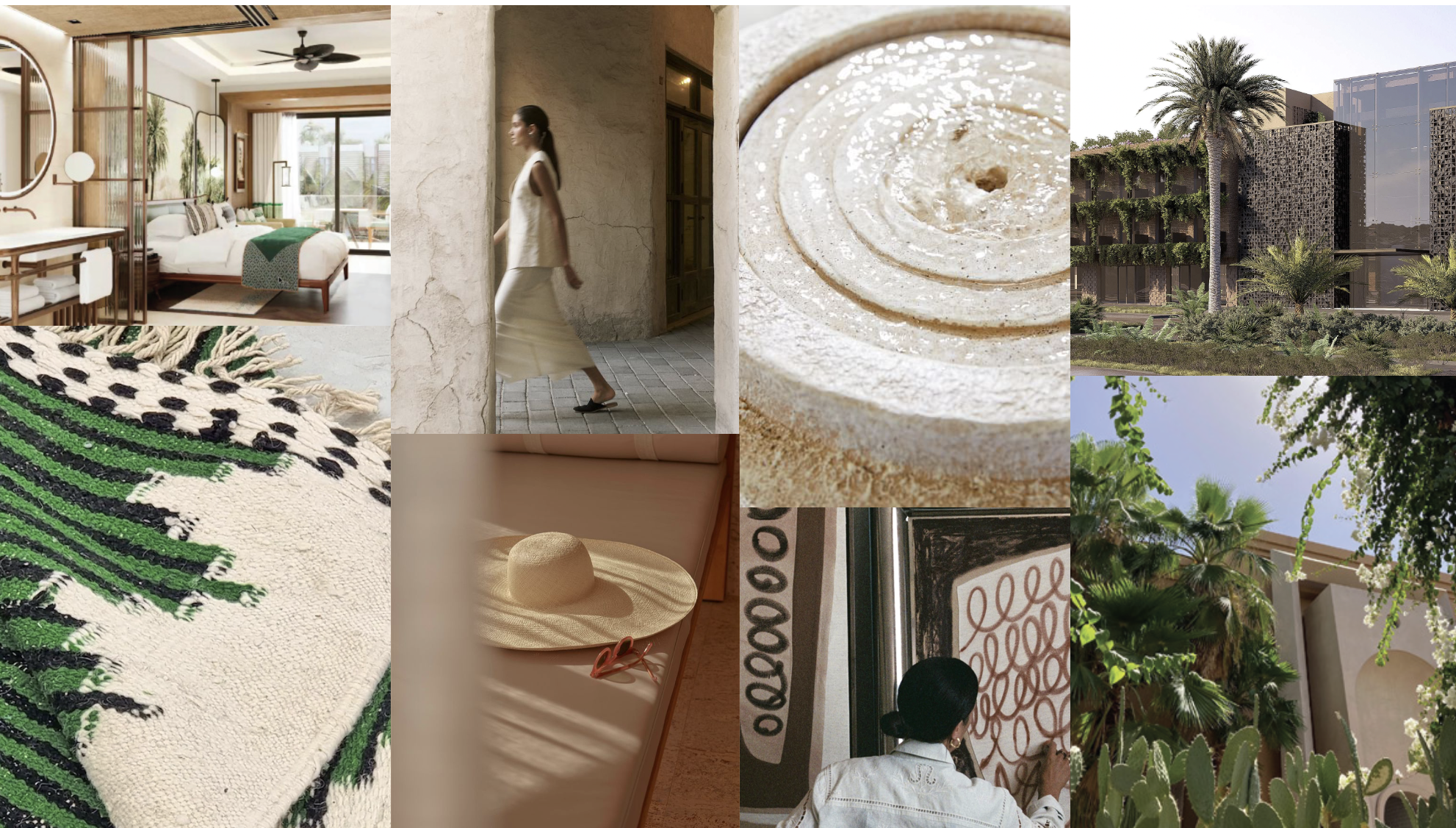
At the heart of contemporary Moroccan architecture, surrounded by refreshing gardens, treasures of Moroccan craftsmanship are showcased in a modern and sophisticated setting. Offering refined comfort, the hotel aims above all to be a place for stimulating exchanges, nurturing the curiosity and creativity of travelers, whether for business or leisure. The Royal Neomad Hotel: A new gateway to the Red City.
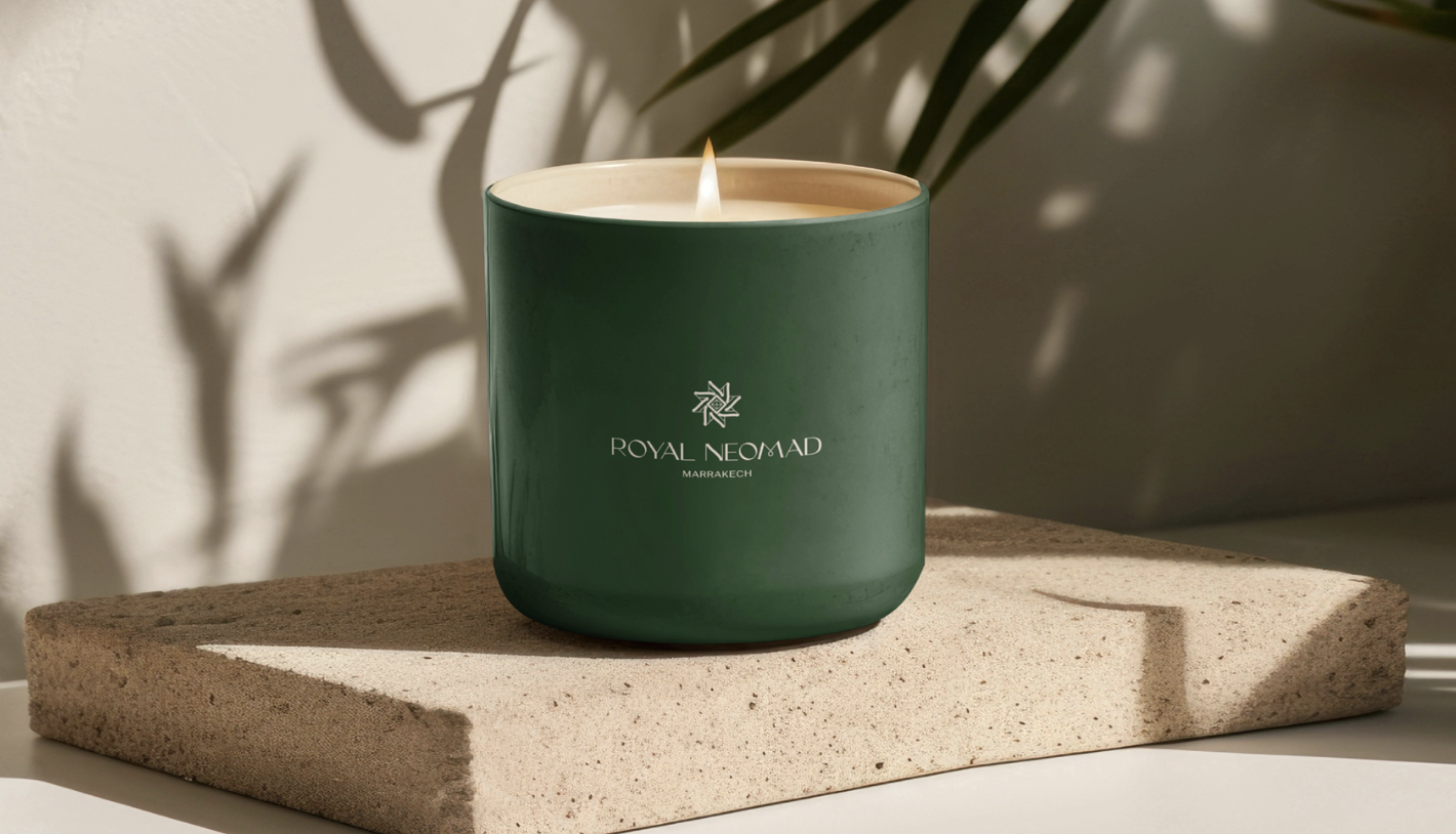
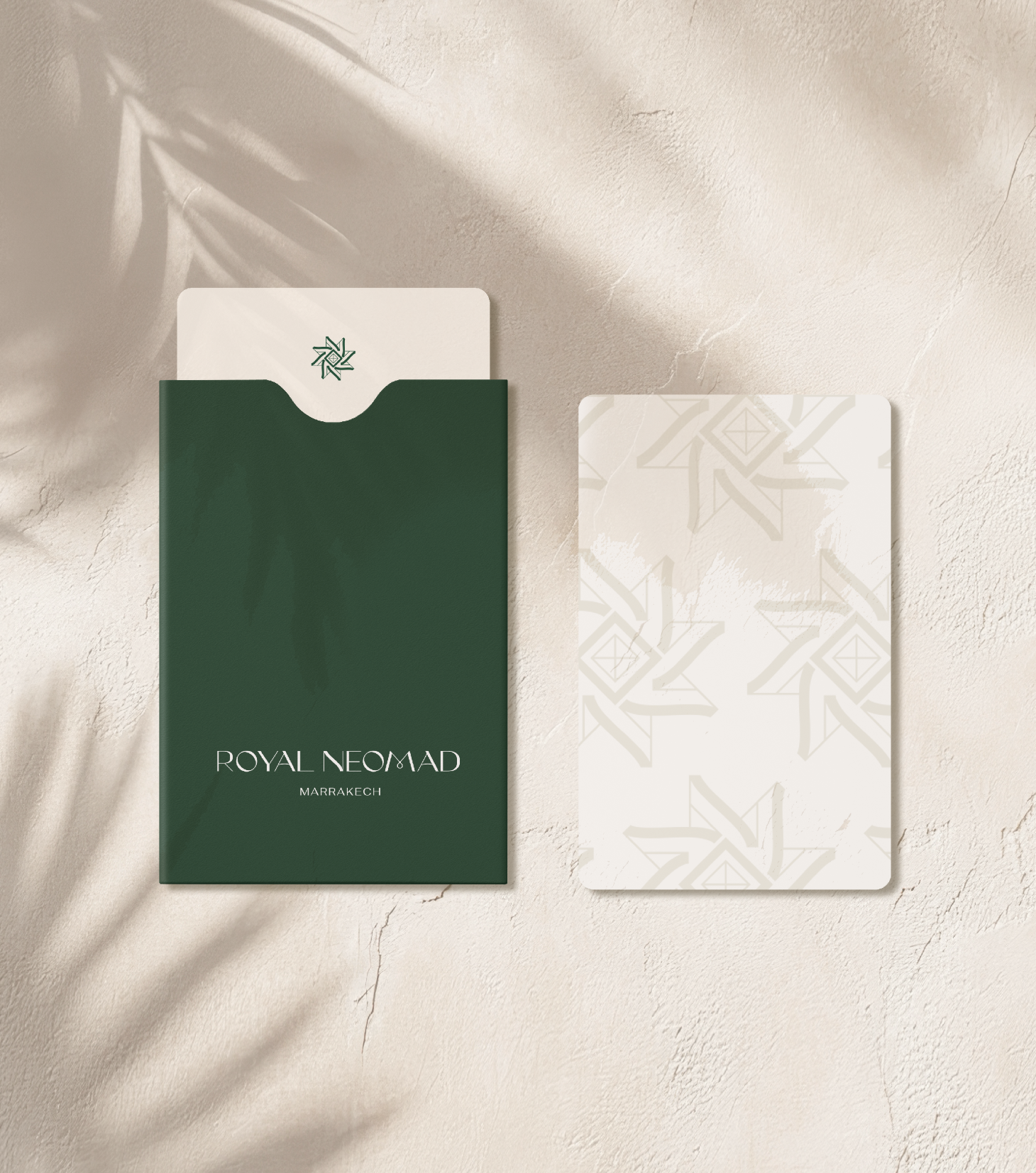
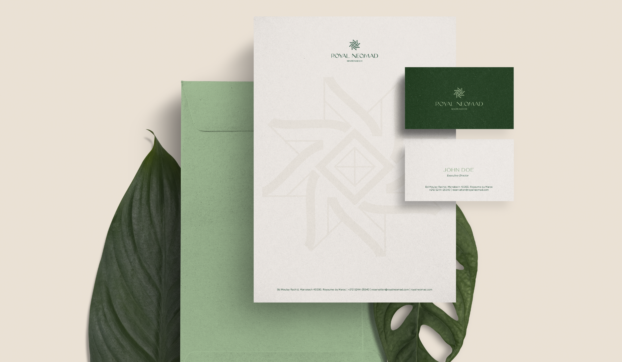
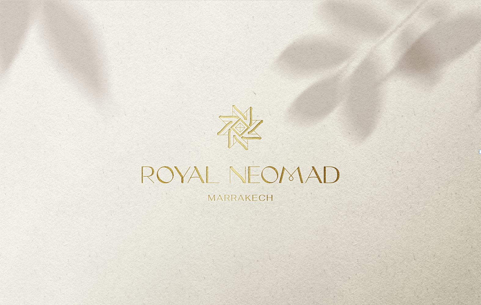
We designed the logo using a typeface that combines thin and thicker lines, while reworking the letters A, N, and M to incorporate curves. This choice gives the logo an aesthetic that is both elegant and welcoming. It also evokes movement, combining geometric shapes with more organic elements.
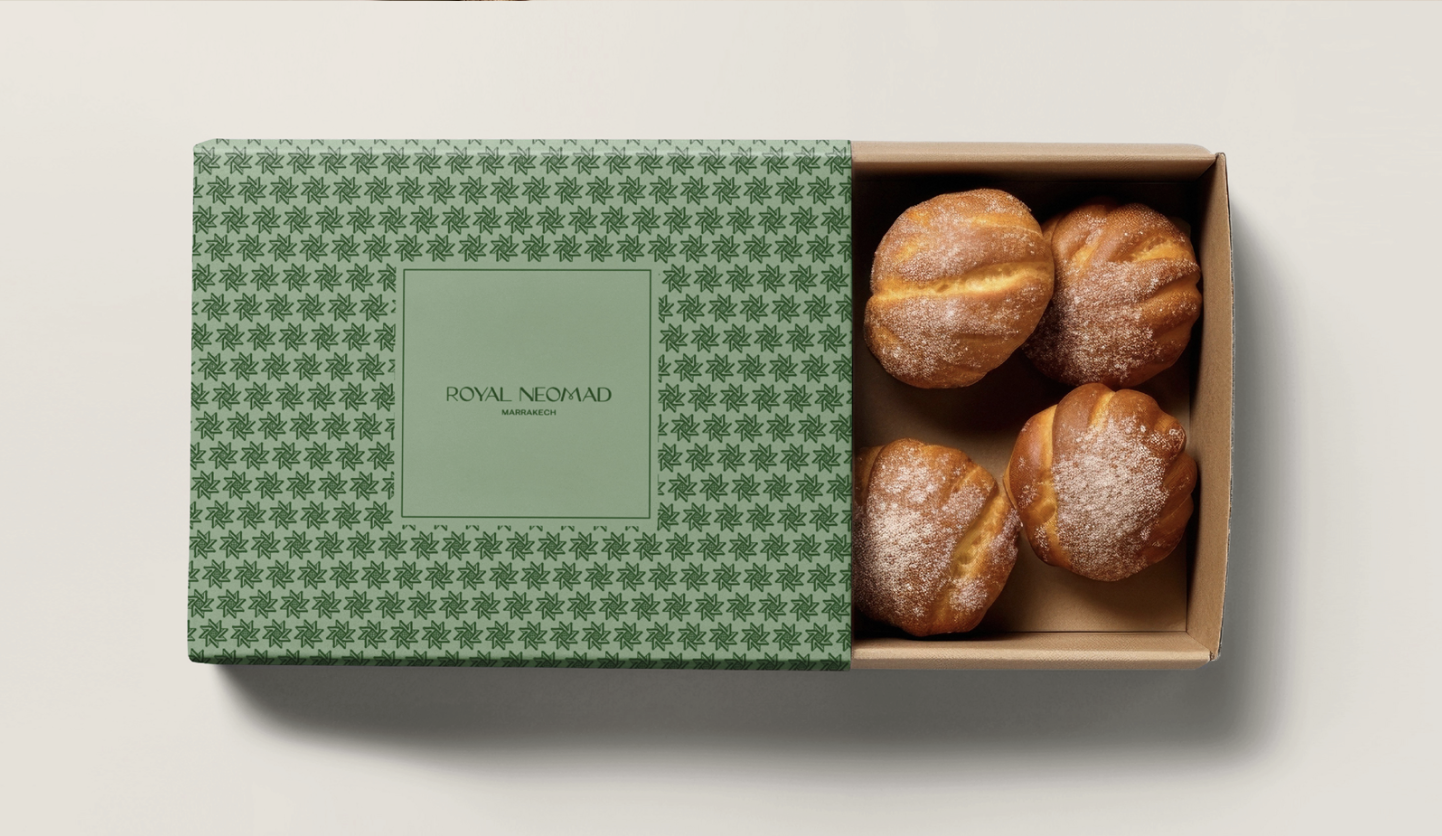
For the icon, we duplicated the letters N (from Neomad) to create an eight-pointed star, a traditional Moroccan symbol. At the center of this icon, a diamond symbolizes Almas, the parent company.